uWaterloo Quest
UI/UX Design
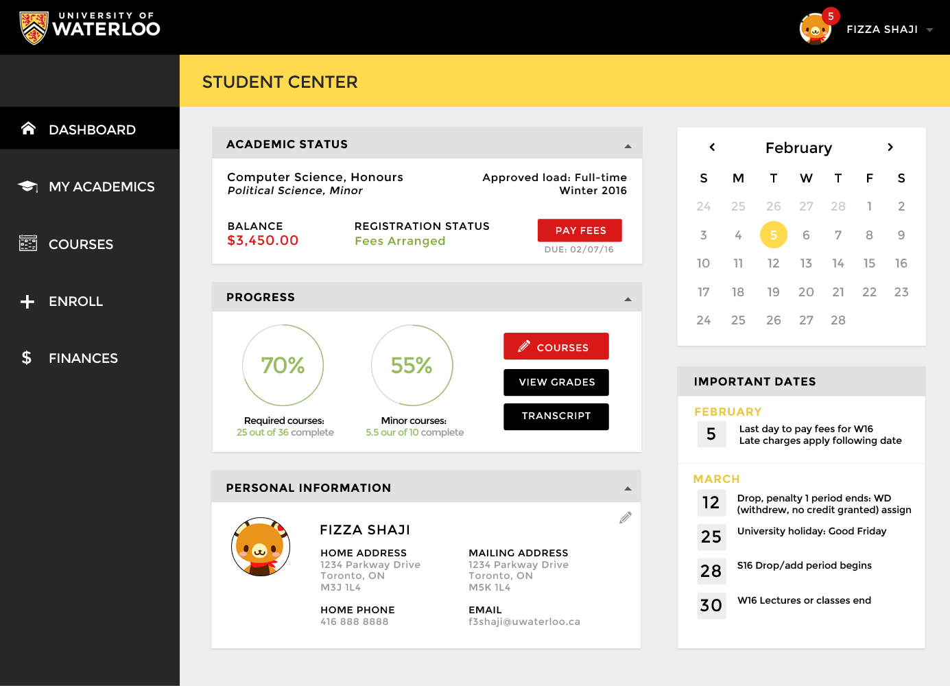
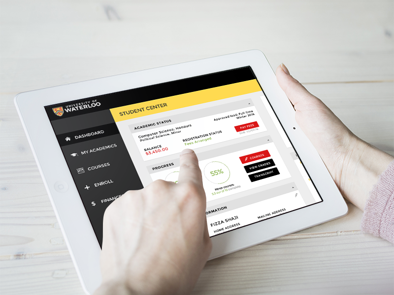
A subdivision of the Quest information system used by the University of Waterloo is the Student IS. It provides students with a centralized platform to access to their termly schedules, grades, transcripts, enroll into courses, and check their financial status with the university. I took it on as a personal project to re-design the homepage of the Quest website interface.
Dashboard Design
The problem
When I first used Quest as a student, I remember feeling frustrated when navigating in between pages and tabs. A simple task like enrolling into a course proved to be more time consuming than I presumed. The problem was in the website navigation. When the navigation transitioned from a list navigation on the landing page to a tab navigation used on the remaining pages of the website, it created an illusion that information was disconnected. Below I have included some snapshots of what Quest looks like right now.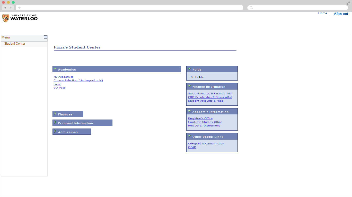 Current Landing page for Quest
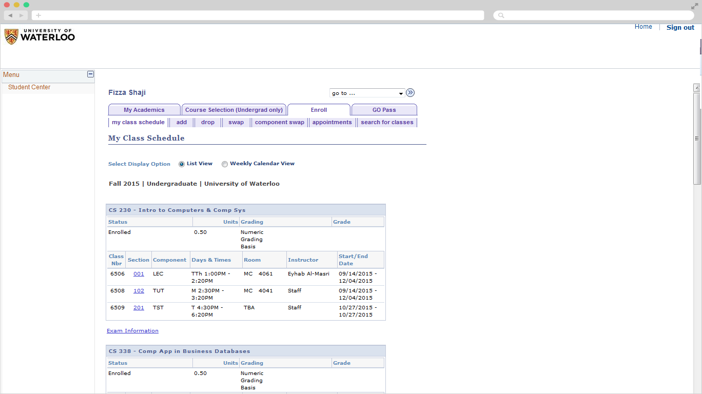 Tabs and Vertical Navigation
Goals
I wanted to take on a pet project and see how can I improve the Quest website and ultimately improve the student experience while using it. Specifically, improving the dashboard and navigation of the interface were my biggest concerns. Below are some goals that were to be achieved in the process. Stakeholders:- Website provides easy access to financial, academic and personal information about the student
- A dashboard containing quick links for easy student access
- Have access to enroll into courses, view tuition fees, and edit personal information
- Site is visually appealing
- Site is easily navigated